Federal Budget Federal Deficit: an excess of the federal government's spending over its revenue Federal Debt: the financial obligations of a national government resulting from deficit spending
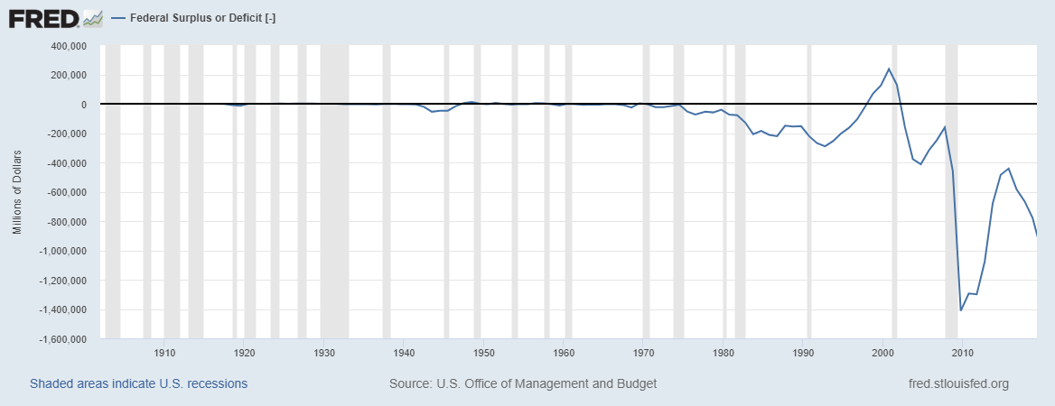
U.S. Office of Management and Budget, Federal Surplus or Deficit [-] [FYFSD], retrieved from FRED, Federal Reserve Bank of St. Louis; https://fred.stlouisfed.org/series/FYFSD
Graph 1 (above): Note that this graph is not adjusted for inflation* This graph measures the federal surplus or deficit in millions of dollars over a period of approximately 100 years in America. The shaded areas in this graph represent recessions in the United States. According to the graph, there was economic stability for a while. Towards 1975, the United States began to go into a recession that worsened over time. There were some time periods where the federal deficit has improved, such as the time period between 1993 and 1999; however, in 2008 the stock market crashed and the federal deficit worsened again. America is still experiencing the ramifications of this debt. As you can see, we have not yet been able to improve the economy to the extent that it used to be back from 1900 to 1970. Since 2008, even when the economy begins to improve, as a country we are still unable to go back to the economy we had before the 2000s. Below is the graph for federal surplus and deficit as well as the difference between federal deficit and federal debt. The variable on this graph is the millions of dollars (y-axis). Over the periods of recessions (the shaded areas), the amount of money has declined. As you can see around 1983, 2001 and especially 2009, the amount of dollars had declined rapidly within the shaded areas. This shows that periods of economic recession often leads to national deficit, which over time builds to national debt. On the other hand, periods of expansion (the white areas), the amount of money generally increased. The variable was at its peak at 2000. The Federal Surplus was 236,241 million dollars. The variable was at its peak here because there was a period of expansion. This period of expansion lasted from 1997 to 2000, and then the economy began to fall again.
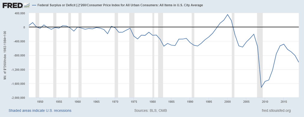
Graph 2 (above): Note that this graph is adjusted for inflation* This graph measures the federal surplus and deficit that is adjusted for inflation. This means that the consumer price index was taken into account. It is important to calculate inflation because the value of money changes over time. Without adjusting for inflation, this graph would not make sense because the value of money is constantly changing. Similar to the first graph, the shaded areas on this graph represent recessions in the United States. This graph, unlike the first graph shows more of the deficit and surpluses in the country than the first graph. The variable on this graph is millions of dollars that has been adjusted for inflation. In other words, the millions of dollars was multiplied by 260 and divided by the 2020 consumer price index to convert to current dollars. During the periods of recessions (the shaded areas), there was an increase in the federal deficit. At these times, the value of money decreased, so the amount of money decreased. The biggest decline in dollars was during the 2008 economic recession. The variable was at its peak in around year 2000 during the economic expansion in the United States. This is because of internal as well as external factors in the economy. These factors may include technological change, new fiscal and monetary policies, or even certain positive global conditions. Ever since that time, there has not been a federal surplus to that extent. This shows us that our economy is not doing as well as it has in previous years, especially since the 2008 economic recession. Between the 1940s and around 1975, there was a certain stability to the economy that we have not experienced in a long time. The United States has found itself in the midst of an extreme debt. On the bright side, America has recovered since the 2008 recession and the deficit has not been as high since.
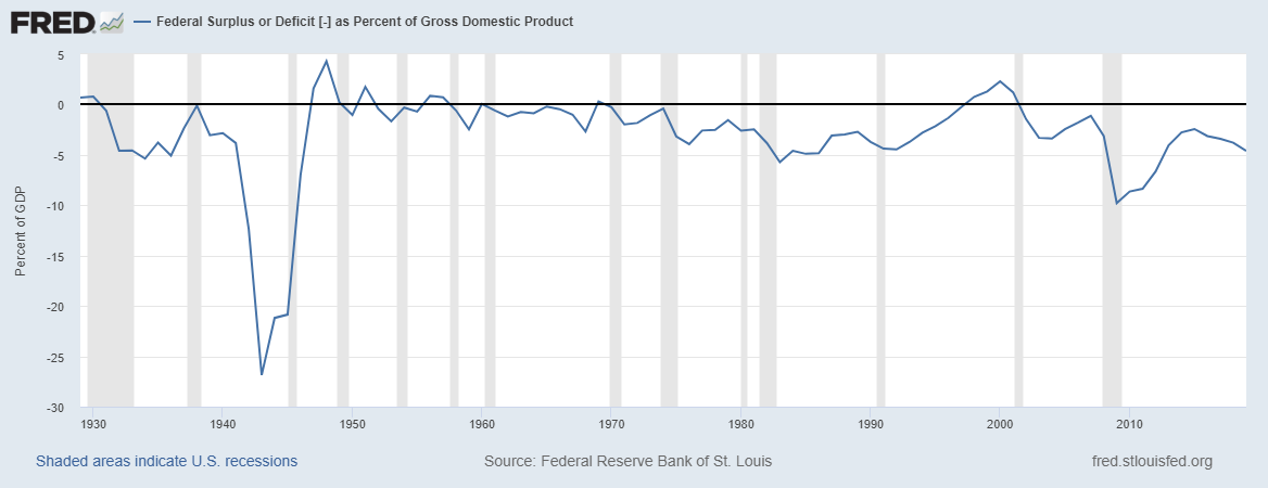
Graph 3 (above): Note that this graph is adjusted for inflation* This graph measures the federal surplus or deficit as a percent of gross domestic product from the years 1930 to present. In other words, this graph measures the percentage of the U.S. economy that is the federal budget. The variable on the graph is the percent of gross domestic product. During the periods of recession (shaded areas), there was generally a decline in the percent of gross domestic product. For example, during the years 1930, 1950, 1983 and 2008, there were noticeable declines in the percent of gross domestic product. In 1930, for example, the percentage dropped from one percent to negative five percent. In 2008 there was a noticeable drop from negative three percent to negative ten percent. The percent of gross domestic product was at its lowest level in 1943 when it dropped to negative 27 percent. The deficit was probably so high because taxes were too low or there was too much government spending at this time. If the federal deficit accumulates for too long, the country would experience national debt. However, the deficit can be lowered before it gets to that point. In order for the deficit to be lowered, the government could curb government spending or raise the citizens' taxes. By doing either or both of these things, the government could significantly improve the economy. On the other hand, there were two periods of expansions. One of them was around 1948, and the other was around 1998. During 1948, the percent of gross domestic product reached almost five percent. During 1998, the percent of gross domestic product reached around three percent. These were the times when the gross domestic product was at its peak. The variable was at its peak because of certain internal as well as external factors in the economy. These factors may have included technological change, new fiscal and monetary policies enforced by the government, or even certain positive global conditions that aided in improving the economy.
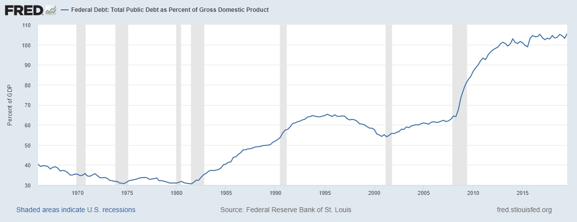
Graph 4 (above): Note that this graph is adjusted for inflation* This graph measures the total federal public debt as a percent of gross domestic product from 1960 to today. In other words, this graph measure the debt to gross domestic product ratio over a period of time. A low debt to gross domestic product ratio is positive, meaning that the economy is making enough profit through providing goods and services to be able to pay back debt. This also means that the economy is not incurring further debt. On the other hand, a high debt to gross domestic product ratio is a negative sign that the economy is not flourishing. The variable on this graph is the percent of gross domestic product. This graph shows that over time, the total public debt as a percent of gross domestic product generally increases. During the periods of recession like 1982 and 2008, the total public debt as a percent of gross domestic product increased. This makes sense because debt increases during periods of economic decline in a country. There were also smaller periods of expansion, where the federal debt decreased. These times include the time period of 1960 to 1982. During these years, the line on the graph went down, symbolizing a decrease in the federal debt. This symbolizes the economy strengthening. During this time, money was circulating well within the economy. Similarly, from 1995 to 2000, the total public debt decreased from 65 percent to 54 percent. These time periods indicate periods of expansion because the federal debt is decreasing. The variable was at its peak around 2016 because the economy was doing poorly. At this time the total public debt was around 105 percent of gross domestic product. Essentially this means that the total public debt was valued at more than 100 percent of the total value of the goods produced and services provided in that year. During this time, money was circulating poorly within the economy. Overall, the total public debt as a percent of gross domestic product has been increasing since 1982 in America. This fact shows us that the American economy has been declining rapidly, continues to decline and will either plateau from here or get worse.
What are the main sources of revenue for the federal government? 1. Income taxes paid by individuals: $1.48 trillion, or about 47% of all tax revenues. 2. Payroll taxes paid jointly by workers and employers: $1.07 trillion, about 34% of all tax revenues. 3. Corporate income taxes paid by businesses: $341.7 billion, or about 11% of all tax revenues. 4. Custom duties and excise taxes (tax on imports and tax on goods like gasoline): about 4% of all tax revenues 5. Miscellaneous: about 5% of all tax revenues
What has happened to corporate taxes as percent of Federal Revenues over time? Over recent decades, the share of federal revenues coming from corporate taxes has fallen. The Great Recession, as well as the policies that were enacted to combat it, including temporary tax cuts depressed the federal revenues below the typical revenues of recent decades. Revenues have fallen from 18 percent to 14.6 percent in 2009 and 2010 and has not recovered much since. In 2018, the total revenue reached 16.5 percent of GDP due to the enactment of the 2017 tax law. However, this is still below the prior 40-year average of 17.4 percent of GDP.
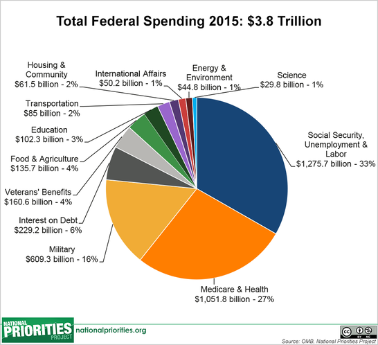
Where does the money go?: As seen on the pie chart, the total federal spending is divided into many different categories. The majority of federal spending goes to Medicare and Health, Social Security, Unemployment and Labor and military. These three categories make up about 76 percent of total federal spending. The other 24 percent of federal spending is comprised of interest on debt, veterans' benefits, food and agriculture, education, transportation, housing and community, international affairs, energy and environment and science.
Discretionary Spending is the portion of the budget that the president requests and Congress appropriates every year. It represents less than one-third of the total federal budget.
Mandatory Spending is federal spending that is spent based on existing laws rather than the budgeting process. For instance, spending for Social Security is based on the eligibility rules for that program. Mandatory spending is not part of the annual appropriations process.
Definitions from Wikipedia Graphs Created from Federal Reserve Economic Data (adjusted for CPI by me) Photos from Google Photos Explanations by me Questions answered from Center on Budget and Policy Priorities Website created by Justina Ramdhany